
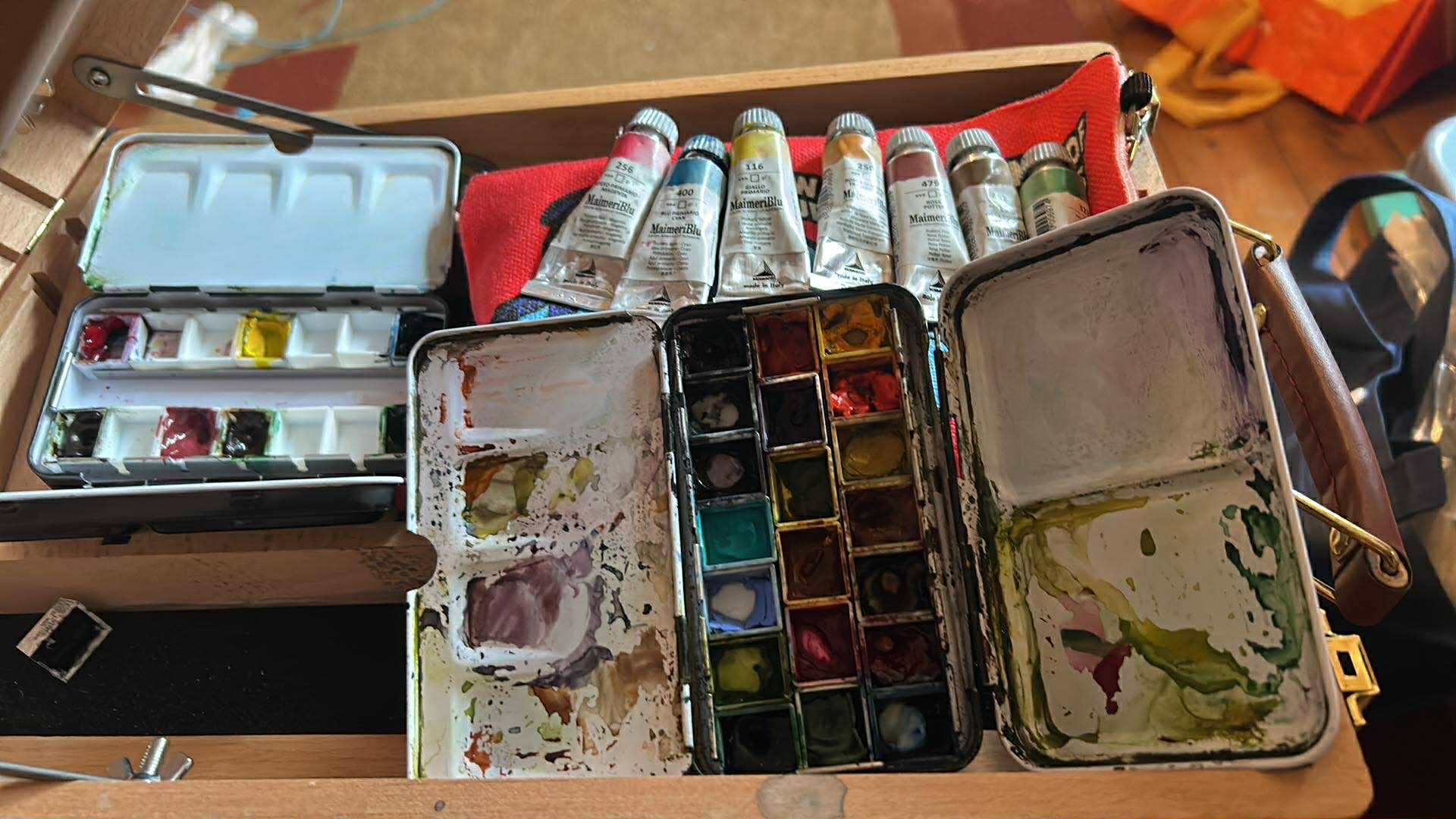
There is always that anticipated excitement of a package arriving and knowing it’s a fresh haul of watercolours!! Sadly, I dont have a specialised art supply shop locally, so its either an online order or a trip out to the amazing Bromleys in Bolton or The Art Shop Skipton for me.
This week, the anticipation is at an all time high as I’ve got samples from A. Gallo on the way. But before those artisanal Italian beauties even arrive, my watercolour box is already stocked with a variety of exceptional brands.
The Move to Professional Grade
After years of using my trusty W&N Cotman paints, and the eventual realisation that there is a difference in quality with paint grades, ie the cheaper ones are less pigmented and use fillers. Around 5 years ago I was ready to explore an unknown world of professional grade watercolours. Where do I start? I soon realised there was a whole world of other brands out there, each with their own unique characteristics.
I started with Holbein – it was like a polite guest to the party. Because they don’t use ox gall, the paint stays exactly where you put it. It’s creamy, reliable, and behaves well and the colours are amazing.
QoR – The wild child. Thanks to their Aquazol binder, the pigment practically explodes when it hits the water. It’s chaotic, aggressive, unpredictable and incredibly fun to use!
Schmincke & Wallace Seymour – Then there’s the ‘old world’ charm. Schmincke is like refined German engineering, while Wallace Seymour feels like you’ve dug the pigment straight out of the British hillside.
The Maimeri Logic – Pure and Simple
Amidst all this variety, I landed on Maimeri for a very specific, stubborn reason, they’re all tubes of aingle pigments.
I wanted to explore the raw DNA of the pigment. My foundation became the primaries (cyan, magenta and yellow). They are wonderfully vibrant and full of light. It’s that luminosity that gives watercolour its uniqueness in the painting mediums.
Using just the primaries was a masterclass for me in colour theory and one I love to share with my students too. You can of course make some wonderful earthy colours from just these three primaries but as I do like a new tube of paint from the postie and the convenience, I complimented those primaries with a selection of earthy friends for my palette. Not because I just liked the colour (admit it we’ve all done that) but for the chemistry between these pigments.
Transparent Mars Red & Burnt Umber – these are my rusted, ancient anchors of the set.
Potter’s Pink – Basically just beautiful, granulating dust that makes everything look like a moody dream.
Cupric Green This pigment is the social butterfly among the paints. I chose it for its versatility, it’s the bridge between the bright primaries and the gritty earthy tones. I’ve always struggled with greens, even with my digital illustrations, green has always been a problem. As a standalone colour, cupic green is far too artificial looking, but mixed with any of the other colours in this limited palette, it creates muted shades and greens that I’m currently obsessed with!!!!

The Preferred Brand Dilemma!
People often ask if I have a preferred brand. Honestly? I’m not sure yet.
Some days I want the polite precision of Holbein and other days I want to watch QoR go to war with a piece of paper. I love the heritage of Wallace Seymour and the single pigment purity of my Maimeri colours. And with A. Gallo about to drop through the letterbox, my loyalties are likely to be tested all over again.
My palette tells a story of growth and my understanding of pigments, and it’s a history of my own curiosity. I really love the science behind these pigments, and I love learning. Every brand and indeed pigment brings a different character to the paper (there’s a whole seperate blog on papers there isn’t there 😜)
For now, there’s no definitive verdict. I’m enjoying the fascinating journey into the world of what makes a certain pigment from a certain brand behave the way it does with another and I’m quite happy to let them all keep talking 🙂